










How to Design an Effective Printed Booklet From Start to Finish
A printed booklet earns attention when it solves a real problem without making readers work to find the answer. Whether it is a program, product guide, volunteer handbook, event schedule, menu, or community resource, the strongest booklet feels focused, calm, and easy to use from cover to final page.
Design choices matter, but a good result begins with a plan for the reader, not a color palette. Once the content and page flow are clear, you can select a practical format and explore quick saddle stitch printing options that suit the booklet’s purpose, page count, and expected use.
Why Small Print Booklets Still Work
A booklet gives people a physical reference they can hold, mark up, save, and revisit without notifications or crowded browser tabs competing for attention. It remains useful for event materials, educational guides, catalogs, local services, training resources, and product information. It does not need dozens of pages to be valuable. Readers keep materials that feel relevant and make key information easy to locate.
1. Define the Booklet’s Job
Before choosing fonts or images, write one sentence explaining what the booklet must help someone do. It may help a visitor prepare for an event, compare options, follow instructions, understand services, or save important details for later. Then name the primary reader and list the three questions that person needs answered. Remove anything that does not support those answers. Focus makes every later design decision easier.
2. Build a Clear Reading Path
Readers need a beginning, middle, and end. Put the highest-value information near the front, then group related ideas into short, predictable sections. A simple structure might include:
- A cover that states the promise.
- Quick facts or key takeaways.
- Main instructions, services, or categories.
- Examples, checklists, charts, or schedules.
- Next steps and contact details.
For longer pieces, page numbers, running headers, and a contents page reduce searching. A reader should never have to guess where a topic belongs.
3. Write for Scanning First
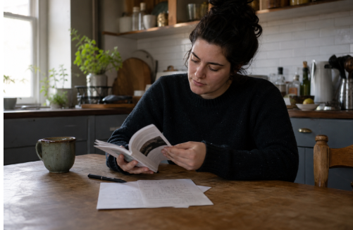
Most people scan before they commit to deeper reading. Use direct sentences, short paragraphs, descriptive subheadings, and numbered steps for processes. Keep one main idea per paragraph. Turn dense explanations into bullets when readers need to compare choices or complete tasks. Callout boxes can highlight definitions, deadlines, warnings, or action items, but use them sparingly so they retain their importance.
4. Use Visuals That Explain
Photos can show people, places, products, or outcomes. Diagrams can explain a process. Charts can make comparisons faster. In every case, the visual should answer a question rather than fill an empty area. Place captions close to images and connect visuals to the nearby text.
Visuals can make complex information easier to understand, while effective graphic design helps keep those elements clear, consistent, and engaging throughout the booklet.
5. Make Type Easy on the Eyes
Choose one dependable typeface for body copy and introduce a second only if it creates a clear hierarchy. Use comfortable text sizing, dark text on a light background, and line lengths that do not force the eye to travel too far. Bold is usually enough for emphasis. Before approving the design, check whether headings stand out, captions differ from body copy, and text remains readable in ordinary room light when held at arm’s length.
6. Give Every Page Room to Breathe
White space is not wasted space. It separates ideas, creates a steady reading rhythm, and makes important details easier to notice. Keep margins consistent, leave room around captions and charts, and keep vital text away from trims and folds. A crowded event guide and a clean event guide may contain the same schedule, but the cleaner version lets visitors find times, locations, and instructions with far less effort.
7. Match the Format to the Reader
Size affects portability, image detail, writing space, and reading comfort. Compact formats work well for handouts, pocket guides, and event materials. Larger formats offer more room for catalogs, instructional diagrams, and photo-heavy content. Consider where the booklet will live: in a hand, on a counter, in the mail, or on a shelf. Let the content determine the page count instead of adding filler simply to make the booklet seem substantial.
8. Treat the Cover as a Promise
A cover should tell readers what they will gain. Use a readable title, one strong image or visual concept, and less clutter than the interior pages. Effective promises include “A Quick Guide to Preparing for the Community Event,” “A Simple Handbook for New Volunteers,” or “A Visual Guide to Local Services.” Reserve the back cover for a short summary, contact information, or a clear next step.
9. Make a Paper Mock-Up
Print the draft on plain paper, fold it into the intended shape, and number pages by hand if needed. Then read it as a real recipient would. This simple test reveals awkward folds, crowded spreads, weak transitions, blank areas, tiny images, and information that is hard to find. Screens show individual pages well, but a mock-up reveals the pace and feel of the complete object.
10. Prepare the Final File Carefully
Confirm the final page size, safe margins, bleed for artwork that reaches an edge, image resolution, color settings, and page order. Export the requested PDF, then open it and inspect every page. If you need to make further edits to a PDF or reuse it for a presentation, you can convert PDF to PPT and make changes to the content more easily.
Common preventable problems include missing fonts, low-resolution images, text placed too close to a fold, and colors that shift because the file was not prepared correctly for print.
Use Data and Hierarchy with Restraint
A chart should communicate its main point before readers study every number. Simplify comparisons, label them clearly, and emphasize the one insight that matters most. The basic principles behind data visualization apply to print as well: visual hierarchy helps readers identify what is most important, what supports it, and what action to take next.
Common Mistakes to Avoid
- Decorating before identifying the reader’s needs.
- Using too many fonts, colors, icons, or graphic styles.
- Writing long paragraphs for a small page size.
- Hiding essential details in inconsistent locations.
- Using screen-quality images that will look poor in print.
- Skipping the mock-up and final file review.
Frequently Asked Questions
How long should a printed booklet be?
It should be as long as the reader’s task requires. A concise guide may need only a few pages, while a catalog or handbook may need more. Remove repetition before adding pages.
Should a booklet use more images than text?
That depends on the subject. Each image should help readers understand, compare, remember, or act. A policy guide may need more text, while a visual instruction guide may rely heavily on images.
What makes a booklet feel professional?
Consistent typography, clean spacing, accurate information, sharp visuals, readable contrast, and careful proofreading make a stronger impression than decorative excess.
How can a booklet be more accessible?
Use plain language, readable body text, strong contrast, clear labels, logical instructions, and more than color alone to communicate meaning.
Conclusion
A useful booklet does not depend on flashy effects or a high page count. It succeeds because its purpose is clear, its structure respects the reader’s time, and every visual and typographic choice supports understanding. Plan the path, simplify the pages, test the physical version, and review the final file carefully. When readers can quickly find what they need, the booklet has done its job.